Blogg
Här finns tekniska artiklar, presentationer och nyheter om arkitektur och systemutveckling. Håll dig uppdaterad, följ oss på LinkedIn
Här finns tekniska artiklar, presentationer och nyheter om arkitektur och systemutveckling. Håll dig uppdaterad, följ oss på LinkedIn

The initial W3C Web Components specification draft was introduced way back in 2011. Every now and then over the years I’ve read articles and blog posts about the progress, but it’s only recently that v1 of the spec has been adopted by the major browser vendors. In the meantime, popular frontend libraries and frameworks like React, Vue, and Angular have created their own separate ways of creating components. For me, this raises a few questions:
In this two part blog series I will try to answer these questions by creating sample components using different techniques and subsequently integrating them in some popular frameworks. First we will go through a quick rundown of some basic concepts before moving on to explore stencil.js in the second part of the series.
Web Components are a set of new native platform features that lets you create your own HTML elements like <my-action-button> or <user-avatar>. Like standard HTML elements they can have attributes, properties and methods, fire and respond to events, and even have encapsulated styles and DOM trees to bring along their own look and feel. Let’s have a quick overview of the key parts before we continue.
The new element <template> enables you to write markup templates that are not displayed in the rendered page. Although it can be used for other purposes, its primary use would be to define the basis of a custom element’s content and associated styles.
<template id="hello-world-template">
  <style>
    section {
      color: red;
    }
  </style>

  <header>Hello World!</header>
  <section id="msg"></section>
</template>
Within templates we also have the new <slot> element that enables you to control where any children of the element are rendered within the template.
You can even have multiple slots in a template, each targeted by a name.
A simple example could look like this:
<template>
  <div class="title">
    <slot name="titleslot"></slot>   <!-- named slot -->
  </div>
    ...more markup
  <div>
    <slot></slot>                    <!-- default anonymous slot -->
  </div>
</template>
A custom component, e.g. <my-details> using that template would “pass through” arbitrary content to each of the slots when used in a page:
<my-details some-attribute="attribute-value">
  <span slot="titleslot"><h1>Look, I'm in the title slot!</h1></span>
  <div>
    This div will be rendered in the default slot of the component
  </div>
</details>
This can be a powerful feature when you want to compose or wrap other components!
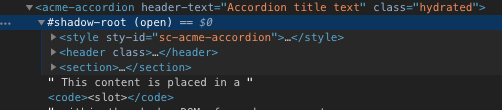
This part consists of a set of javascript APIs for attaching an encapsulated shadow DOM tree to an element. A shadow DOM tree is rendered separately from the regular document DOM (referred to as the light DOM in documentation). This allows you to keep its features private, so they can be scripted and styled without the fear of colliding with other parts of the document.
This isolation means that you can safely use simple and descriptive id attributes, class names and css styles within your component - without worrying about clashes or leakage from the document DOM (and vice versa). If you inspect the DOM structure a custom component in dev tools you will see the shadow DOM boundary:
Cloning and appending template snippets could be useful on its own to compose parts of a layout, but for interactivity we need javascript. The Custom Component spec includes native APIs that allows you to implement and register a new class that extends an HTMLElement using standard ES6 syntax.
After registration it can be used in page exactly like any standard element. The API is relatively simple and gives a component class some lifecycle callbacks.
| Name | Is Invoked when |
|---|---|
| constructor() | An instance of the element is created or upgraded. Useful for initializing state, settings up event listeners, or creating Shadow DOM. See the spec for restrictions on what you can do in the constructor. |
| connectedCallback() | The element is inserted into the DOM. Useful for running setup code, such as fetching resources or rendering UI. Generally, you should try to delay work until this time |
| attributeChangedCallback() | Each time one of the custom element’s attributes is added, removed, or changed. The actual effect of an attribute change is entirely up to you. |
| disconnectedCallback() | The element is removed from the DOM. Useful for running clean-up code. |
Components are divided into two types, with slightly different purposes:
These are new standalone elements that extends the base HTMLElement and could be something like:
<my-greeter first-name="John" last-name="Doe"></my-greeter>
A new element must have a “-“ in the name and can not be self-closing. The name requirement is there to guarantee that it will not clash with any existing or future W3C standard tags. The base HTMLElement is indeed very basic, so you’re really starting with an empty shell in an autonomous component.
This variant is used when you want to extend existing HTML elements, such as a button, p or input. By using the “is” attribute on the original tag element you instruct the browser to replace the standard element with your custom implementation, like this:
<button is="my-custom-button">
An important feature of extending a standard element like a button is that you keep all existing attributes, styles and behaviour of the original, native button as its implementation will extend HTMLButtonElement.
Which type of element you choose of course depends on your use case, but if you are developing a component that semantically differs from any existing element, an autonomous component would probably be a better choice.
Let’s say we have a site or app where we need to display accordion-type info (e.g. Q&A section) with a header and some content that is displayed when you click the header. It would be nice to be able to use some simple markup for this, maybe something like:
<card-accordion header-text="Where can I get help with X?">
  If you have problems with....(more html)
</card-accordion>
Let’s create this component using just plain js, html and css. We start by defining a template in an html page:
<template id="card-accordion-template">
  <style>
    header {
      position: relative;
      cursor: pointer;
    }
    /*  more css... */
  </style>

  <host>
    <header></header>
    <section>
      <slot></slot>
    </section>
  </host>
</template>
NOTE: You don’t have to use a template to define the contents of a component. You could create the content entirely within your class using native APIs like createElement, appendChild or innerHTML etc.
Just a template is not enough since we want some expand/collapse behaviour. Let’s define our component implementation (inside a script tag):
class CardAccordion extends HTMLElement {
  "use strict";

  // Define which attributes to get attributeChangedCallback's for
  static get observedAttributes() {
    return ['header-text'];
  }

  constructor() {
    super();

    // State of accordion
    this._open = false;

    // Create a shadow root
    this._shadow = this.attachShadow({mode: 'open'});

    // Get the template we want to use
    const template = document.querySelector('#card-accordion-template');

    // Attach a clone of the template to the shadow DOM root
    this._shadow.appendChild(template.content.cloneNode(true));

    // Keep a reference to the header element
    this._header = this._shadow.querySelector("header");

    // Bind eventhandler to this instance
    this.toggleOpen = this.toggleOpen.bind(this);
  }

  toggleOpen() {
    this._open = !this._open;
    this._open ? this._header.classList.add("open") : this._header.classList.remove("open");
  }


  // Invoked each time the custom element is appended into a document-connected element
  connectedCallback() {
    this._header.addEventListener("click", this.toggleOpen);
  }

  // Invoked when the custom element is disconnected from the document's DOM.
  disconnectedCallback() {
    this._header.removeEventListener("click", this.toggleOpen);
  }

  // Invoked when one of the custom element's attributes is added, removed, or changed.
  // observedAttributes defines which attributes we will get the callback for.
  attributeChangedCallback(name, oldVal, newVal) {
    if (oldVal === newVal) {
      return;
    }

    // If statement not strictly necessary since we only have 1 attribute in this case...
    if (name === 'header-text') {
      this._header.innerHTML = newVal;
    }
  }
}
Almost there, now we just need to register the component with a tag-name (e.g. “acme-accordion”) so that the browser knows what to do when it encounters it:
window.customElements.define('acme-accordion', CardAccordion);
Now our new element is ready be used in the body of the page and we have our first component!
<acme-accordion header-text="Where can I get help with X?">
  If you have problems with device X, please contact...
</acme-accordion>

That’s a lot of boilerplate code for something as simple as a toggle accordion widget! But remember that we’re working with pure, native low-level DOM APIs here. No frameworks, libraries or external dependencies - just native javascript, html and css and it works out of the box in all major browsers.
It’s somewhat refreshing to be able to build something that just runs in the browser - without having to install a few GBs worth of node dependencies and depending on a very complicated buildchain…
But at the same time it’s hardly the best developer experience and arguably not a viable approach in a larger real-world use case. If we’re building components for production use, we would surely want support for:
Fortunately for us there are several frameworks and tools to help us with that. One such tool is stencil.js that we’ll explore in part 2.